Dark theme switcher with React, TailwindCSS, and Jotai
All websites should have a dark theme available, not only for accessibility purposes but also because it looks cool.
In this article, I'll show how it can be implemented in a React project with TailwindCSS and Jotai as a stage manager.
Template
Before writing any React code it's a good idea to create HTML template with required visuals:
import { MonitorCog, Moon, Sun } from "lucide-react";
function ThemeSwitcher() {
return (
<div className="inline-flex gap-1 rounded-xl bg-slate-100 p-1 text-black dark:bg-slate-800 dark:text-white">
<span title="Appearance: Follow System Settings">
<MonitorCog
size={24}
strokeWidth={1.5}
className="rounded-lg border border-slate-300 bg-white p-1 dark:bg-slate-600 dark:border-slate-500"
/>
</span>
<span title="Appearance: Light">
<Sun size={24} strokeWidth={1.5} className="p-1" />
</span>
<span title="Appearance: Dark">
<Moon size={24} strokeWidth={1.5} className="p-1" />
</span>
</div>
);
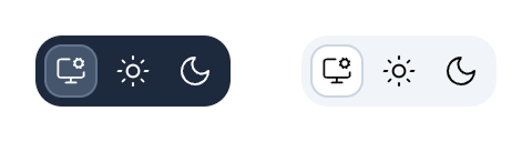
}Result:
State
To hold state of the currently selected theme lets use Jotai:
import { atomWithStorage } from "jotai/utils";

export type Theme = "system" | "dark" | "light";

export const themeAtom = atomWithStorage<Theme>(
  "theme", // localStorage key
  "system", // default value
  undefined, // use default storage, which is localStorage
  { getOnInit: true }, // get value from localStorage when atom is initialized
);
If you haven't used Jotai before, it's a simple state manager that allows you to define state "atoms" outside of React. With Jotai, I wouldn't need to overcomplicate a project with a React context and write some manual logic to interact with local storage.
Reactivity
Since we have template and state defined let's make our component reactive and also remove some code duplication in the template:
import { useAtom } from "jotai";
import { twJoin } from "tailwind-merge";
import { MonitorCog, Moon, Sun } from "lucide-react";
import { themeAtom } from "./atoms.ts";

const themes: Array<{
  value: Theme;
  label: string;
  icon: typeof MonitorCog;
}> = [
  {
    value: "system",
    label: "Appearance: Follow System Settings",
    icon: MonitorCog,
  },
  {
    value: "light",
    label: "Appearance: Light",
    icon: Sun,
  },
  {
    value: "dark",
    label: "Appearance: Dark",
    icon: Moon,
  },
];

function ThemeSwitcher() {
  const [currentTheme, setCurrentTheme] = useAtom(themeAtom);

  return (
    <div className="inline-flex gap-1 rounded-xl bg-slate-100 p-1 text-black dark:bg-slate-800 dark:text-white">
      {themes.map((theme) => {
        const Icon = theme.icon;

        return (
          <span key={theme.value} title={theme.label}>
            <Icon
              size={24}
              strokeWidth={1.5}
              onClick={() => setCurrentTheme(theme.value)}
              className={twJoin(
                "rounded-lg p-1",
                currentTheme === theme.value &&
                  "border-slate-300 bg-white dark:border-slate-500 dark:bg-slate-600",
              )}
            />
          </span>
        );
      })}
    </div>
  );
}
Our switcher is clickable, but we still need to do a few more things to make it work.
First, we must tell TailwindCSS to use the .dark class for the dark theme trigger instead of the default prefers-color-scheme behavior. To do it, we need to modify index.css by adding the following:
@import "tailwindcss";

@custom-variant dark (&:where(.dark, .dark *));
Second, we need to add a .dark class to the document whenever the theme is set to dark or if it's set to system and the system theme is set to dark. To do that, let's use useEffect:
useEffect(() => {
  const isDarkMode =
    darkMode === "dark" ||
    (darkMode === "system" &&
      window.matchMedia("(prefers-color-scheme: dark)").matches);

  document.documentElement.classList.toggle("dark", isDarkMode);
}, [darkMode]);
One downside of this approach is that the user might see a flash of the light theme until our ThemeSwitcher loads and its useEffect runs. Most of the time, with React, it's okay since you are probably writing SPA or SSR with hydration, and the flash might happen only on the page's first load. But if you still want to fix it, you can add a JS script somewhere on the page:
document.documentElement.classList.toggle(
  "dark",
  localStorage.theme === "dark" ||
    ((!("theme" in localStorage) || localStorage.theme === "system") &&
      window.matchMedia("(prefers-color-scheme: dark)").matches),
);
This will run before the React application loads end and should remove the flash.
And don't forget to actually implement a dark theme in the code by adding dark: classes where it's required.